Heading home for the holidays? Google Maps is hoping to help you get there faster, and safer, than ever before.
This holiday season is bringing a little more stress than usual due to the increasing prevalence of the coronavirus. While many people are forgoing annual traditions, some are forging ahead, choosing to drive to see family and friends. To do that in the safest way possible, Google Maps has not only analyzed user data to help people figure out ways to beat the crowd, it has also launched a suite of tools, including a new “Covid layer,” so users can get real-time information about their risk.
“This holiday, family gatherings will be smaller or take place virtually to make sure everyone stays safe and healthy,” Google wrote on its blog. “Indoor activities will move outdoors. And that international holiday vacation will potentially transform into an epic road trip to nearby attractions as you stop to sightsee at local hidden gems along the way. But even still, people are prepping to make classic holiday dishes, looking for ways to experience winter and finding new, safe ways to be together.”
The company added, it analyzed Google Maps data “before and during the pandemic… to see how people across the U.S. are getting ready for the holidays.” Here are a few key data points and tools Google Maps users can open to reduce their risk.

Avoid crowds:
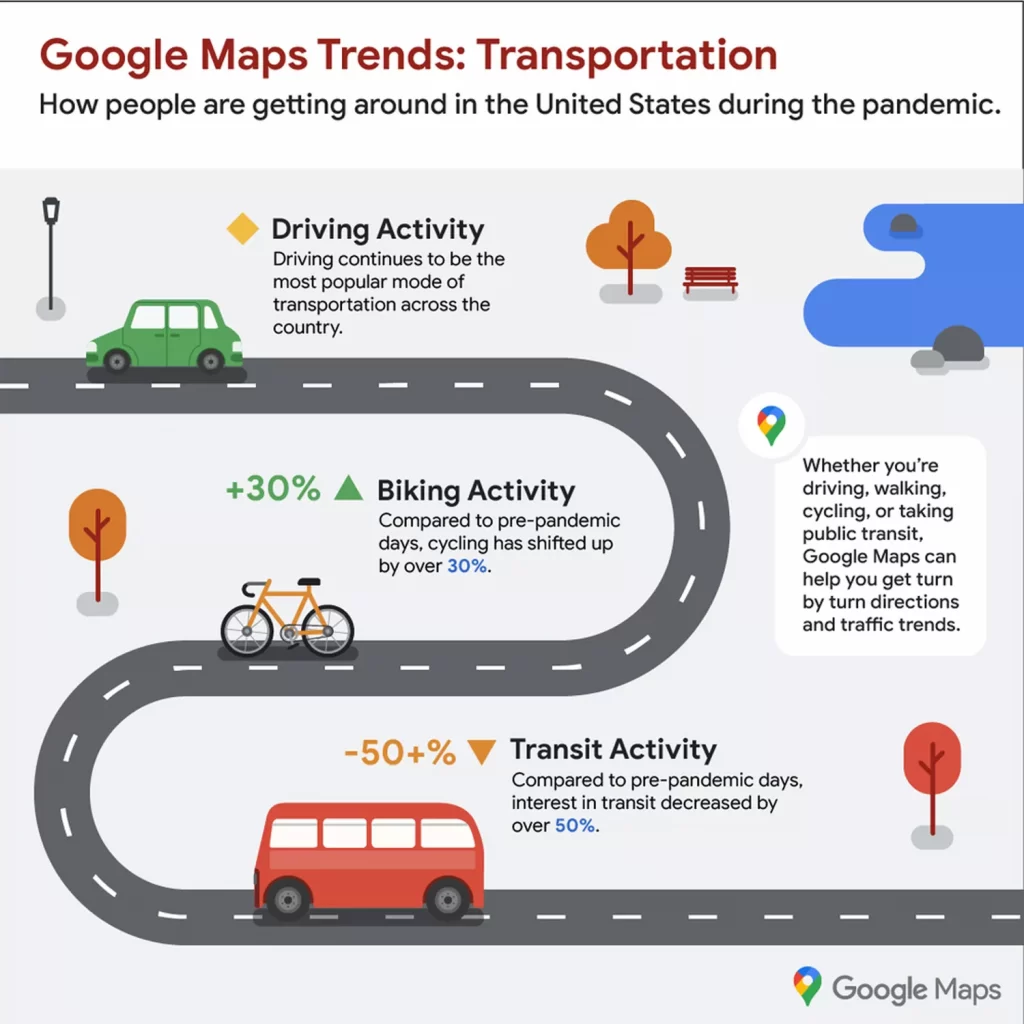
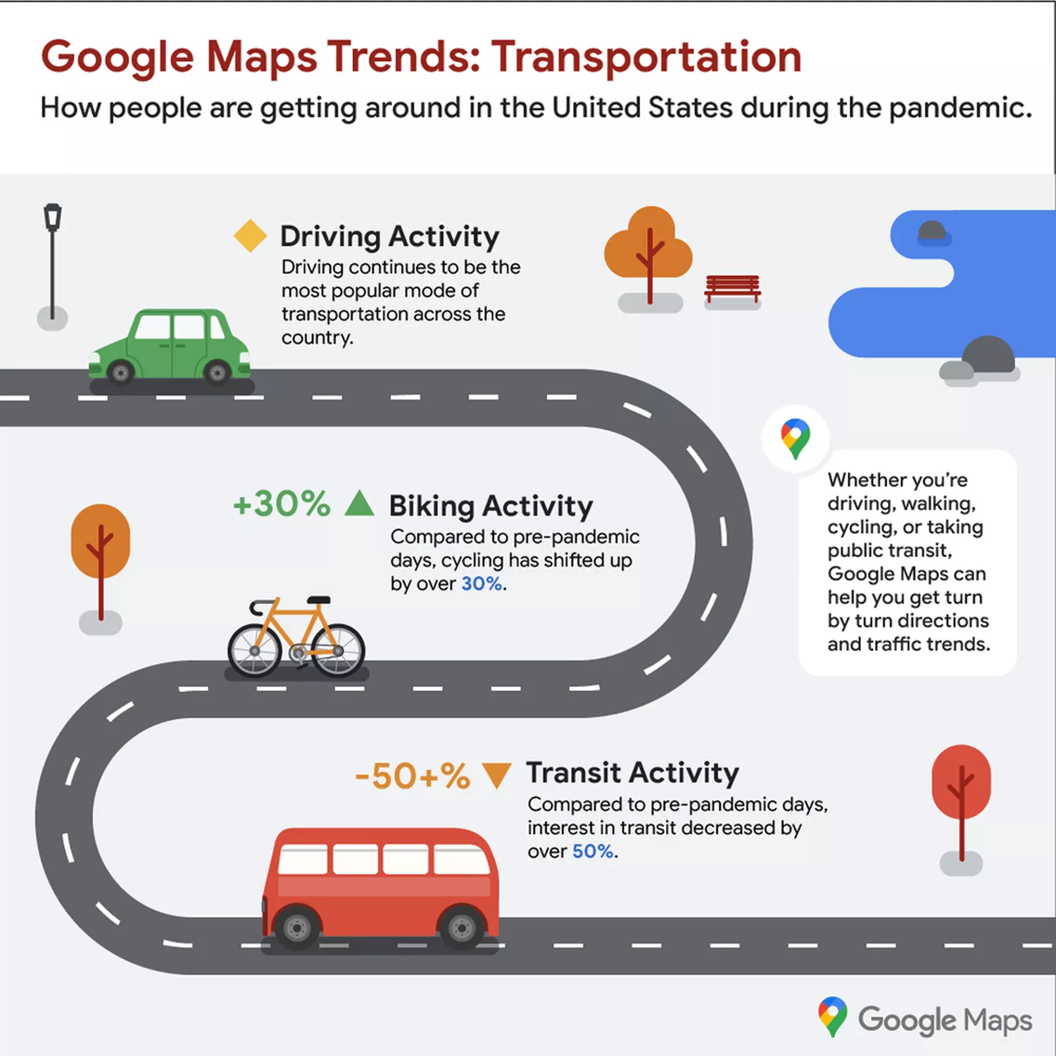
The company, perhaps unsurprisingly, found that more people are choosing to drive rather than fly to their destinations during the pandemic. To help people have a safer drive, the company suggests users look at the “popular times” and “live busyness” information in Google Maps to avoid the crowds.
“Popular times and live busyness information in Google Maps have always been essential holiday tools, helping you avoid unwanted crowds,” it wrote. “These tools help you know in advance when places are going to be busy so you can save precious time and also social distance.”
According to its data analysis, this means skipping coffee pickups on Saturday mornings at 10 a.m., because that’s when coffee shops across America tend to be most packed. It also means staying out of grocery stores on Saturday afternoons between 1-3 p.m. when lines are likely to be the longest. (See more of the busiest times for restaurants, parks, and pharmacies here.)
Know your covid risk:
Beyond the data analysis, Google Maps also recently unveiled its “covid layer.” It’s a simple tool that allows users to see updated coronavirus risk numbers in their community and around the country. The information, Google Maps says, is pulled from The New York Times, Wikipedia, JHU CSSE Covid-19 data, and others.
To use the layer, open the Google Maps app. Next, on the top right, tap “layers.” Then, press the “Covid-19” layer. It will then display the 7-day average for the number of new cases per 100,000 people in your area. Zoom out to see state-by-state data before making any out of state plans.
Check on public transit:
Many people may be considering taking public transportation this holiday season to get to friends and family. Over the summer, Google announced a new tool to not only tell users peak public transport times but also to provide users with information on how crowded public transport is in real-time.
“If you need to take transit, Google Maps can help you more easily social distance with live crowdedness information,” Google shared in a blog post. “On Android and iOS globally, you’ll start seeing how crowded your bus, train, or subway line is right now based on real-time feedback from Google Maps users around the world (wherever data is available).”
To use the feature, search for a station in Google Maps or tap on the station on the map to see the departure board and busyness data.
“Covid-19 has certainly impacted the way that we move around in the world,” Google added. “As cities and countries across the globe adapt, we’re committed to bringing the most pertinent information right to your fingertips. So when you’re ready and able to, you can safely venture out.”


